CSS (Cascading Style Sheets) is used to style HTML elements on web pages. Each HTML element is essentially represented as a box. Consider the paragraph element selected on this MDN page.
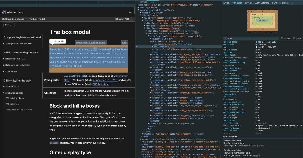
The paragraph element is represented as a box with a width of 532 pixels, a height of 140 pixels, no padding or border, and margins of 16 pixels at the top and 32 pixels at the bottom. The dimensions above are specified in pixels—an absolute unit. Absolute units are typically more useful for print layouts.
For content displayed and consumed on screens, it’s preferable to use relative units. These units, as their name suggests, are relative to other elements on the screen. The two most commonly used relative units are:
- em
- rem
EMS
When you specify a CSS value of an element in em:
- The CSS value automatically scales relative to the font size of the element
- The element’s font size, in turn, scales relative to its parent element’s font size
Consider the following HTML & CSS:
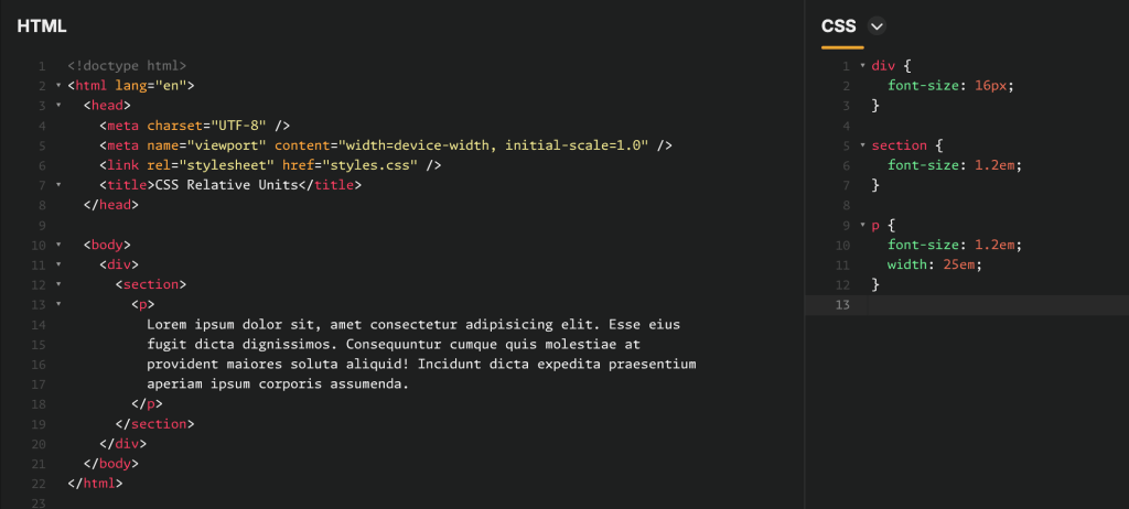
Here you have a paragraph element embedded inside a section, which in turn, is embedded inside an enclosing div.
Given that the font size specified for the div is 16px, the CSS values for the section and paragraph elements evaluate to:
- Section font size: 1.2em = 1.2 × font size of parent element = 1.2 × 16px = 19.2px
- Paragraph font size: 1.2em = 1.2 × font size of parent element = 1.2 × 19.2px = 23.04px
- Paragraph width: 25em = 25 × font size of element = 25 × 23.04px = 576px
The problem with ems
Ems are relative to the parent, which can lead to unexpected outcomes with deeply nested elements. This compounding effect may cause unintended scaling of font sizes or dimensions. For example, consider the following nested li elements:
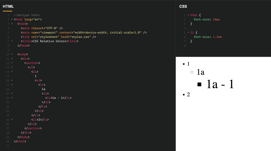
- The first
lielement1has a font size of 1.5em = 1.5 × 16px = 24px - Element
1a, embedded inside element1, has a font size of 1.5em = 1.5 × 24px = 36px - Element
1a - 1, embedded inside element1a, has a font size of 1.5em = 1.5 × 36px = 54px
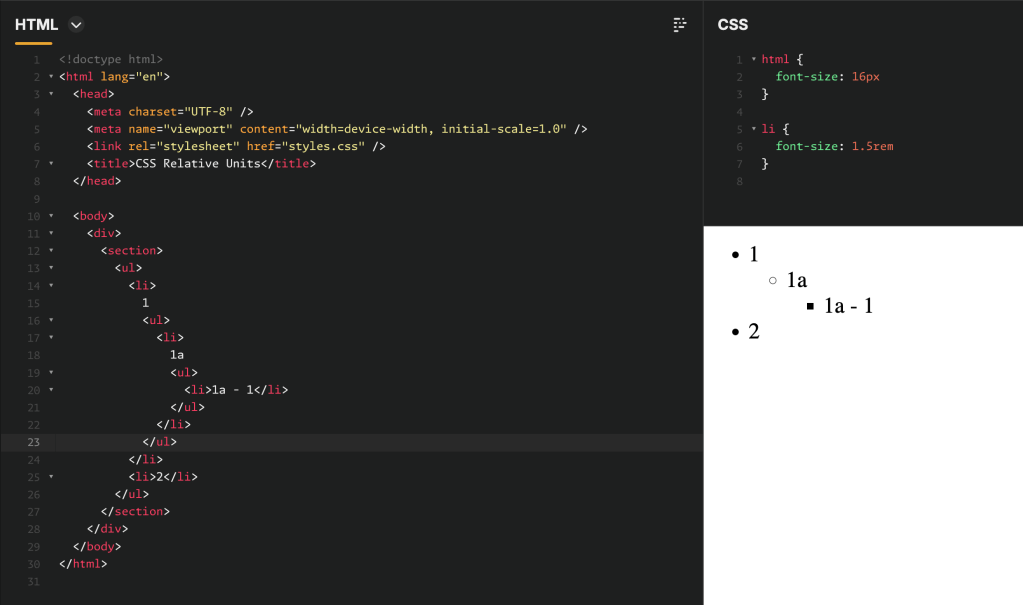
To prevent successively nested elements from getting larger, their CSS values can be specified in rem units. Rem units are evaluated relative to the “root” html element. With the font-size of the root element specified at 16px, the font-size of all li elements is evaluated as 1.5 rem = 1.5 × 16px = 24px (as shown in the screenshot below), as illustrated in the screenshot below.
 Aadi's Blog